|
|
Post by Nathan Ford - HJG on Feb 19, 2019 5:44:11 GMT
Looking good BA  |
|
|
|
Post by Herman on Feb 19, 2019 13:26:46 GMT
I always enjoy seeing airliners in their celebration "Retro" liveries. Thanks for that video Nathan.
Herman
|
|
|
|
Post by Peter Liddell - HJG Admin on Feb 19, 2019 13:44:27 GMT
|
|
|
|
Post by aerofoto - HJG Admin on Feb 19, 2019 21:34:50 GMT
Living in the past .... BUT HEY .... don't we all  If we didn't .... then .... we wouldn't be doing what we do here .... and this web site wouldn't exist either Even so .... and corporate geneology being justifiably celerated or not .... I can imagine English accents (probably from the north of England .... like around Machester .... not Tony though since he doesn't live there snd I've detected ha has an entirely different accent) saying something like .... "I DORNT LARK EET UT OLL"  Mark C AKL/NZ |
|
|
|
Post by Tony Madge - HJG on Feb 20, 2019 8:31:28 GMT
Yes Peter, they did a lousy job on the engines, looks like an afterthought, the rest looks great. I loved the BOAC and BEA colours also the 70's style Alitalia stood out
|
|
|
|
Post by aerofoto - HJG Admin on Feb 20, 2019 17:58:46 GMT
UMMM .... that's an B747-8 .... is it not Mark C AKL/NZ |
|
|
|
Post by Nathan Ford - HJG on Feb 21, 2019 8:51:56 GMT
I just wish we would put out a TAA or Australian Airlines 737-800.
I think it would be F.A.B.
Nathan
|
|
|
|
Post by Peter Liddell - HJG Admin on Mar 21, 2019 21:46:07 GMT
Here's the next 744... Negus "British airways" G-CIVB 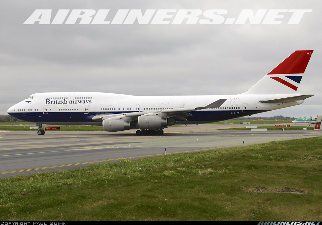 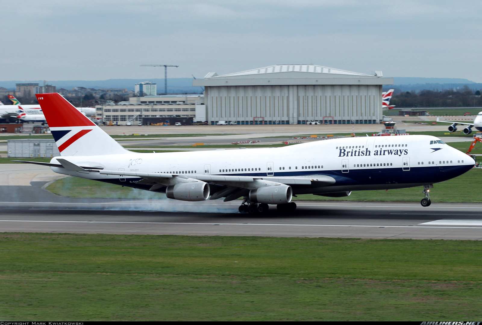 To my eye the titles are a little off (too high, too tall/not wide enough, speedbird also too high) but less annoying to me than the engines on the BOAC one. |
|
|
|
Post by lmhariano on Mar 23, 2019 4:04:03 GMT
Negus was the last one. There were other two 747s for the BA 100-year celebrations*: The BOAC we've already discussed: 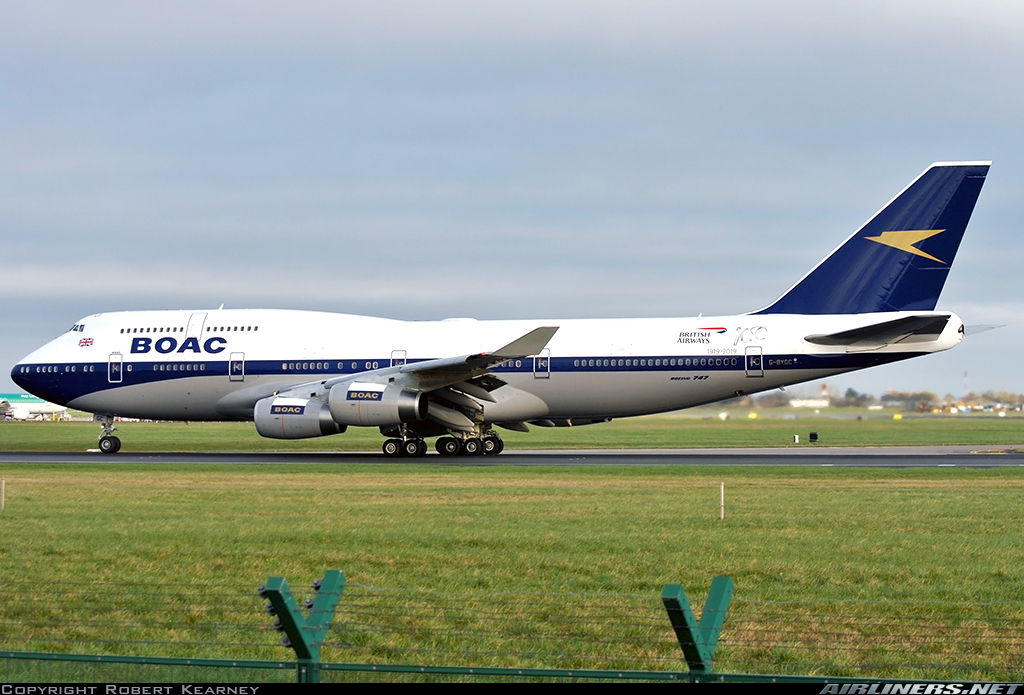 And the Landor livery (that actually returned to the 744): 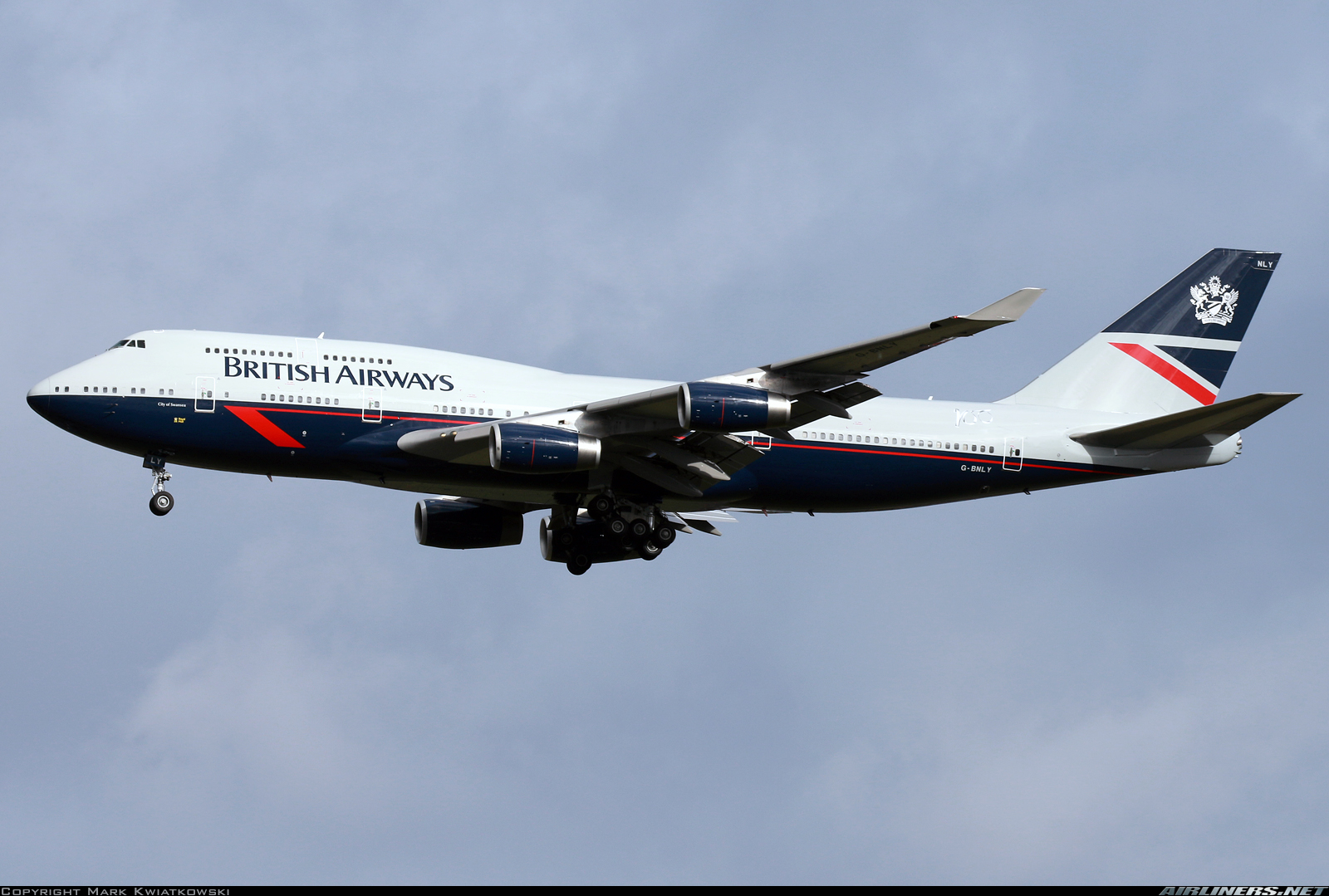 But personally, the best one they did was a BEA A319: 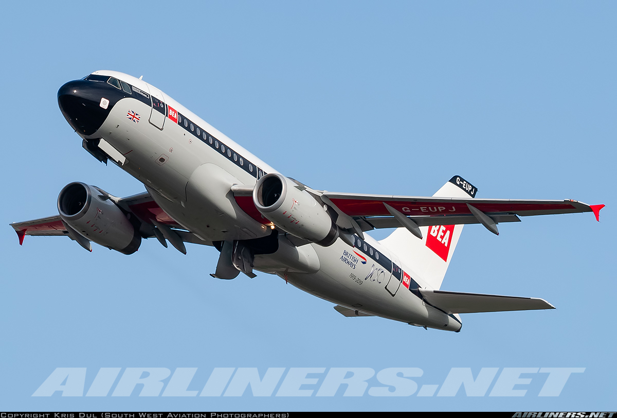 * BA 100 years too? I only had KLM and Avianca in my list of 2019 centenaries. * BA 100 years too? I only had KLM and Avianca in my list of 2019 centenaries. |
|
|
|
Post by Erik Ingram - HJG on Mar 23, 2019 8:37:55 GMT
To my eye the titles are a little off (too high, too tall/not wide enough, speedbird also too high) but less annoying to me than the engines on the BOAC one. I think you're right about the Speedbird being a little too high up, but the titles seem okay compared with the original: www.airliners.net/photo/British-Airways/Boeing-747-136/2639664The problem, I think, is that the letters (particularly the 'B' in British) are pushed up against windows that weren't there on short-deck 747s which makes it look more compressed than it actually is. Regardless, aside from the Landor livery (which I've always hated), it's definitely great to see these in the air! |
|
|
|
Post by Peter Liddell - HJG Admin on Mar 24, 2019 1:32:22 GMT
To my eye the titles are a little off (too high, too tall/not wide enough, speedbird also too high) but less annoying to me than the engines on the BOAC one. I think you're right about the Speedbird being a little too high up, but the titles seem okay compared with the original: www.airliners.net/photo/British-Airways/Boeing-747-136/2639664The problem, I think, is that the letters (particularly the 'B' in British) are pushed up against windows that weren't there on short-deck 747s which makes it look more compressed than it actually is. Regardless, aside from the Landor livery (which I've always hated), it's definitely great to see these in the air! If you compare it to a -200 you'll see what I mean a little more clearly... www.airliners.net/photo/British-Airways/Boeing-747-236B/293712www.airliners.net/photo/British-Airways/Boeing-747-236B/634If the titles were just a little lower (look at the "h" especially) that would be so much better... but as i said it's minor. |
|
|
|
Post by christrott on Mar 24, 2019 14:08:56 GMT
I agree that it looks higher, however I wonder if the changes from the -200 to the -400 have something to do with it because the space between the doors and the bottom of the lettering appears consistent as doe the overall height. It's one of those challenges about doing a "retro" livery - even when you put it on the "same" airplane, it can look different because of the changes over the years. I suspect they used the original paint specs so the lettering and logo should be correct in height since that should be something they had exact dimensions of. How it fits on the -400 is a different thing.
|
|